Everything you ever wanted to know about text decoration…
I recently had a lot of fun working on some changes to the link styles on GOV.UK. Here’s everything I learned about text decoration in the process.

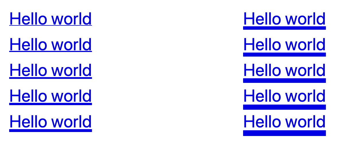
We made two subtle but important changes to links.
-
We moved underlines further away from the text, and made them consistently 1px thick, regardless of font size. This makes the link text easier to read, as the shape of each word is easier to discern.
-
We made the hover state clearer, by thickening the underline to 3px when a user hovers over the link.
This addresses a usability issue originally raised in an audit carried by the Digital Accessibility Centre way back in May 2019. They said:
“The colour change when a user hovers over a link is not clear and this was especially difficult for low vision users to determine.
Ensuring that the state change is distinctive would benefit low vision users in particular, while benefiting all mouse users in general.”
You might not think that moving an underline a few pixels and changing its thickness is particularly cutting-edge or interesting.
However it relies on two CSS properties, text-decoration-thickness and text-underline-offset, which have only recently been introduced to some browsers.
As a result, we had to spend some time understanding exactly how these new properties worked, and whether they were mature enough to use.
A quick primer on shorthand properties
Before we start digging in to the text-decoration property, it’s useful to understand a few things about shorthand properties in CSS.
Quoting heavily from the excellent overview of shorthand CSS properties on MDN Web Docs:
Shorthand properties are CSS properties that let you set the values of multiple other CSS properties simultaneously.
For instance, the CSS
backgroundproperty is a shorthand property that’s able to define the values ofbackground-color,background-image,background-repeat, andbackground-position.
Importantly, there’s a ‘tricky edge case’ which is worth understanding – you’ll see later how it affects text-decoration:
A value which is not specified is set to its initial value. That sounds anecdotal, but it really means that it overrides previously set values. Therefore:
background-color: red;
background: url(images/bg.gif) no-repeat left top;
will not set the color of the background to
redbut tobackground-color’s default,transparent, as the second rule has precedence.
Throughout this article I’m also going to use the term ‘longhand’ to refer to properties that are not shorthand properties.
With that out the way, let take a brief trip back in time to see how the text-decoration property has changed.
A brief history of text-decoration
CSS 1 (1996) and CSS 2 (1998–2011)
In these earliest versions of CSS, text-decoration was a longhand property that only accepted the values none, underline, overline, line-through, blink[1] and inherit:
text-decoration: underline;So, you could use it to add decoration to your text, but you had no control over its appearance – you were constrained to a solid line with its colour and thickness based on the text.
CSS Text Decoration Module Level 3 (2019)
CSS Text Decoration Module Level 3 introduced new text-decoration-line, text-decoration-style and text-decoration-color properties.
Now you could change the colour of the underline independently of the text colour, and choose between solid, double, dotted, dashed or wavy lines:
text-decoration-line: underline;
text-decoration-style: dotted;
text-decoration-color: navy;
But it also transformed the existing text-decoration property into a shorthand property, allowing you to set line, style and color in a single declaration:
text-decoration: navy dotted underline;CSS Text Decoration Module Level 4 (Working Draft)
CSS Text Decoration Module Level 4, which is still a working draft, introduces the text-decoration-thickness and text-underline-offset properties, allowing you control over the thickness of the line and the offset of the line from the text baseline respectively:
text-decoration-line: underline;
text-decoration-style: dotted;
text-decoration-color: navy;
text-decoration-thickness: 4px;
text-underline-offset: 0.1em;
Again, it changes the text-decoration shorthand property to include the new text-decoration-thickness.
However, the text-underline-offset property is intentionally excluded from the shorthand property, and has to be set separately:
text-decoration: navy 4px dotted underline;
text-underline-offset: 0.1em;
Pitfalls and tips for using text decoration properties
Supporting all browsers
Older browsers including all versions of Internet Explorer only understand text-decoration as it was defined in CSS 2.
If you use text-decoration as a shorthand property, Internet Explorer will ignore it completely:
.link {
    /* Has no effect in IE11 or other browsers that do not
       support CSS Text Decoration Module Level 3 */
    text-decoration: navy 4px dotted underline;
}
You can set text-decoration twice, as recommended in the specification:
.link {
    text-decoration: underline; /* CSS 2 */
    text-decoration: navy 4px dotted underline; /* CSS 4 */
}
However, not all browsers that support CSS Text Decoration Module Level 4 support the shorthand property – notably, Safari will ignore the second declaration even though it supports all of the properties individually[2].
To get the best browser support, set text-decoration as a longhand property, then set the various text decoration sub-properties independently:
.link {
    text-decoration: underline;
    text-decoration-color: navy;
    text-decoration-thickness: 4px;
    text-decoration-style: dotted;
}
Avoiding undoing styles when using the shorthand property
Remember the ‘tricky edge case’ with shorthand properties that was mentioned earlier? If you set text-decoration after any of the text-decoration-* properties, all of those properties will be reset back to their initial value.
As an example, consider a modifier class that’s designed to remove underlines from links, except when active or hovered over:
.link {
    text-decoration: underline;
    text-decoration-color: navy;
    text-decoration-thickness: 4px;
    text-decoration-style: dotted;
}

.link--no-underline:link,
.link--no-underline:visited {
    text-decoration: none;
}

.link--no-underline:hover,
.link--no-underline:active {
    text-decoration: underline;
}
The link will have no underline except when hovered or active, when you might reasonably expect it to have a 4px navy dotted underline.
But, in a browser that treats it as a shorthand property it’s effectively the same as doing this:
.link {
    text-decoration: underline;
    text-decoration-color: navy;
    text-decoration-thickness: 4px;
    text-decoration-style: dotted;
}

.link--no-underline:link,
.link--no-underline:visited {
    text-decoration-line: none;
    text-decoration-thickness: initial;
    text-decoration-style: initial;
    text-decoration-color: initial;
}

.link--no-underline:hover,
.link--no-underline:active {
    text-decoration: underline;
    text-decoration-thickness: initial;
    text-decoration-style: initial;
    text-decoration-color: initial;
}
As a result, the thickness, colour and style are all reset to their initial user-agent defaults, and when hovering over our link we just get a boring default underline.
The exception to this is, once again, Safari, where text-decoration is not a shorthand property, and instead acts like a sort of alias for text-decoration-line. Unlike other browsers it does not set the other text-decoration-* properties back to initial.
One option is to set the text-decoration-line longhand property directly, like this:
.link {
    text-decoration: underline;
    text-decoration-color: navy;
    text-decoration-thickness: 4px;
    text-decoration-style: dotted;
}

.link--no-underline:link,
.link--no-underline:visited {
    text-decoration-line: none;
}

.link--no-underline:hover,
.link--no-underline:active {
    text-decoration-line: underline;
}
However, this won’t remove the underline in browsers that only support the CSS 2 text-decoration property, like Internet Explorer, as they don’t recognise text-decoration-line.
If that’s something you care about, you could do this instead:
.link--no-underline:not(:hover):not(:active) {
    text-decoration: none;
}
This is exactly what we do on GOV.UK and should work in all browsers except IE6-8 and Safari 3.1, which do not support :not().
Supporting users who change the font size in their browser
I mentioned in the introduction that we’ve made the link underlines consistently 1px thick, but that was a slight over-simplification.
If a user zooms their browser in, the underlines would scale accordingly. However, if a user has instead changed the font size in their browser, the underlines would remain 1px thick.
We were concerned that users who do this might not see the underline, so we made sure that the underlines scale appropriately by calculating the underline thickness in rem as well as pixels, and taking whichever value is bigger using the max function.
Diving 1px by 16px (the default font size in most browsers) gives us a value of 0.0625rem:
.link {
  text-decoration-thickness: max(1px, .0625rem);
}
This means that underlines will always be at least 1px thick, but a user who sets the font size in their browser to 32px will see 2px underlines (because 32px × 0.0625 = 2px).
Bugs and quirks
Blink (Chromium, Chrome, Edge and Opera)
-
The
text-underline-offsetis calculated incorrectly.The spec says that the ‘zero position’ for the offset should be the text baseline, but instead the offset changes with the thickness of the underline – as you increase the thickness, it moves further away from the text:
This means that offset is inconsistent with other browsers, and so we’ve ended up having to compromise on the offset value in order to get something that looks good everywhere.
When this bug is fixed, all browsers should place the underline consistently, at which point we’ll likely revisit the offset value again.
-
Changes in text decoration within a multi-column layout are ‘mis-painted’ – hovering over one link in the columns causes other links to be (partially?) underlined:
I recommend playing with the CodePen in a Blink browser (or watching the video attached to the bug report), because I have no idea how to fully describe this rather funky bug.
In GOV.UK Frontend, we decided to disable the link hover state for links in the footer, which is the only component we ship that uses columns.
This means there’s a little inconsistency in the link styles across GOV.UK, but we’re hoping this bug might get fixed soon… 🤞
We also flagged this issue in the release notes, and placed these new link styles behind a feature flag that individual teams needed to opt in to.
(Chromium bug #1190987, which we reported)
-
In Chrome 87–88, Edge 87–88 and Opera 73–74 (the first two versions after
text-decoration-thicknesswas introduced), thetext-decoration-thicknessproperty does not work unless either:text-underline-offsetis set to something other thanautotext-decoration-coloris set to something other thancurrentColor
Webkit (Safari, iOS browsers)
-
Dynamic changes in
text-decoration-thickness(for example on hover) have no effect above certain font sizes, unless the link style changes in another way too.The affected font sizes seem to depend on the underline thickness. In our testing:
- a 2px underline had no effect on text bigger than 15px
- a 3px underline had no effect on text bigger than 19px
- a 5px underline had no effect on text bigger than 27px
You can work around this by also forcing a colour change – even a really subtle one – which is what we’re doing on GOV.UK.
(Webkit bug #224483, which we reported)
-
Webkit’s ink skipping algorithm leaves increasingly large gaps around descenders as you make the underline thicker.
When using a 3px underline, the extra space around the descenders is distracting enough that we ended up disabling ink skipping on hover for GOV.UK.
Past a certain point, the underline on a word with multiple descenders can disappear entirely:
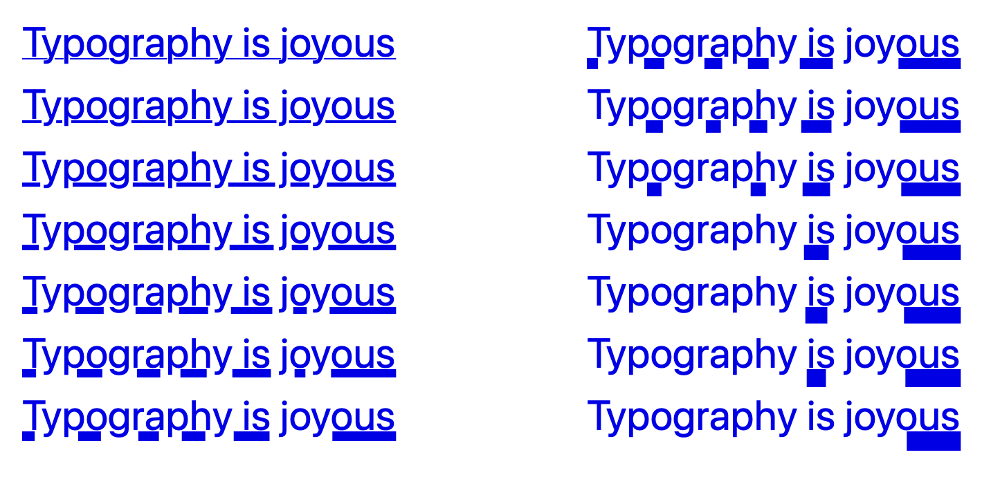
The failing web platform test uses the term dilation to describe this. I’ve no idea if that’s a technical term for it or not…
Blink browsers also seem to dilate [3] the underline more than they need to as well, but not as badly as Webkit browsers do.
The
blinkvalue has since been deprecated in CSS Text Decoration Module Level 3 in favour of animations ↩︎It does recognise shorthand when set using the vendor-prefixed
-webkit-text-decorationproperty, so this may be handled for you if you happen to be using autoprefixer or similar. ↩︎See, I’ve already started using it like it’s a proper term! ↩︎